Monday, January 22, 2018

OUGD601 Synergy between essay and practical

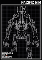
This research lead project set out to explore how How does a movie genre dictate the overall poster design layout for film. Within the dissertation, it explored the history of posters for movies and the different types of genre that can have an impact on their design. In the essay, it was found that genre starts at the poster, It needs to show what genre a film is in a short amount of time and make sure people know what their getting into. To explore this, the practical element of the project was focused on creating a genre based poster of an existing film. For this case, it focused on the movie, Pacific rim, a movie sold as an action, sci-fi movie revolving around giant robots vs monsters. For this practical, I picked apart the movie to what genre tropes were within it and the one I had settled on to design for was its Comic book styled deliverance of the film. Within the essay I touched on the recent movie, Thor Ragnarok and its poster campaign that focused on putting its supporting characters into the spotlight. The practical element is inspired by this as it brings other characters from the film into center stage and allows viewers to get to know who their about to see. Along side this, within the poster trends that was researched for the essay. One of the main ones that are making a return are the use of illustrated posters, the days of generic photoshoped posters are dwindling. This played a big role within the practical element as having the illustrated style allowed for a simple design that reveals nothing from the films story but intrigued the audience into the role of  what the characters could be.


The blue print styled posters are inspired by the use of blueprints in the avengers age of Ultron film that has a comic book genre that I wanted to get across in the posters for this project. The research that was taken up within the essay has really informed the practical in terms of what makes a poster associated with a specific genre and how posters can be used to inform without saying anything at all

OUGD601 Evaluation

Overall, This has been one of the hardest modules ive worked on while at uni, but thats not a bad thing. Its been a very challenging task as writing isn't my strong suit as its always been something ive struggled with. That being said, once i finally got into my dissertation and i started to get going, I really enjoyed what i was writing about and with the support of my tutor, i was able to make sure it all made sense. The practical element was a fun part of the module but i think that if i could have done something different it would have been starting this section earlier as while i was happy with what i made, i was too focused on a singular idea and would of liked to branched out abit more. But that is the only quarrel i had with working on this module.I am very happy with how its been and it might have even sparked something inside of me to write more and lead more research based projects in the future. 

The final poster designs have got a good reaction from my peers and have turned out alright, I was worried once i finished the illustrations that i had spent too much time on them and not the actual poster designs but seeing them printed and getting positive feedback from peer has me happy with the end product

OUGD601 Final Designs


(as this one has more detail within it, having the drop of colour to the visor means that it just breaks up the design a bit from being too white. unfortunately having colour on all the visors is a bit too much on their posters)


OUGD601 practical Crit feedback response

From the crit session, there general thoughts on the poster designs were the same as what i was feeling about the designs. The black posters seem to be the favourite amongst my peers and myself but it was asked to see a poster containing all of the characters ive done to bring them all together. this was a good idea as it is similar to the thor posters againg that had one big poster of all of the characters on it. So i began to work on briging them all together and decide on this:


Its simple design means that the charaters are the main focus of the poster and are what draws in people to view it. The lines in the illustrations have details that get people looking closer at them and have them seeing something new each time. The drawn line separating the logo from the illustrations is based on the actual pacific rim logo hat has a similar crack on it.

OUGD601 practical Poster colour concepts

Having the illustrations finished off it was time to start working on the blueprint styled posters. On actual blue prints there are small sections of information on what the the document was on so for these posters it was decided that having information of each of the mechs would flush out the characters more.having the names of the characters higher up on the layout hierarchy means it is the second item that peoples eyes are drawn to after he illustrations themselves followed by the mechs stats. In terms of the colour scheme, I wanted to make the illustrations pop and be eye catching  so having the designs in white onto of a black background makes them stand out. Aswell as this, i tried using the colours of their represented characters from the film to help people recognise the characters more when they see the film. While they work, they don't have the same presence of the black posters. For me I prefer the black background but im going to take them to a crit group and see what peoples thoughts are.


OUGD601 practical illustrations

been a few weeks since the crit session and ive been drawing up the supporting characters for the posters. Im quite happy with how they came out but it has taken longer than expected to create these vector illustrations of the mechs. So much so that i don't think that starting another genre based poster would be made in time for the hand in. That said though, Im glad these are now done and i can get them onto a poster


Sunday, January 21, 2018

OUGD601 Idea Crit feedback

After showing my practical ideas to a crit session i had some great responses. :

  • the supporting character posters sound like they would be a better choice as it brings in character development before the actual film making people want to see their storeys
  • as the mechs are mechanical based, why not have the posters in a sort of blueprint aesthetic to show off the characters detail 
  • the horror concept sounds like it would be a fun set of posters to work on
  • could focus on the mystery of the monsters in a sort of lovecraftian way
These have been really helpful for me. from this crit, i have decided on the direction will be that of the supporting character based comic book movie styled posters idea. after hearing the blueprint idea in the crit, i really liked the sound of it and i believe that that is a concept i would like to try coming out of this crit session.

OUGD601 practical ideas

Out of the movies i was looking into, the one that stood out to me was the movie, Pacific Rim. Its a film that I really enjoyed following as it was in production and a fun watch. The chance to work with giant robots and monster designs was also a deciding factor of the choice. here are some of the notes of the idea generation stage:


List of best potential ideas
  • (genre category: Comic) a series of illustrated posters showcasing the supporting characters, in this case, the other mechs (jagers) in the film other than the main character. similar to that of the recent thor ragnarock poster campaigns.
  • (Genre catagory: Horror) focusing on the scale of the monsters and their other worldly aesthetic.
  • (Genre catagory: Comedy) a sienfield-esk poster of the relaton between monster and robot


OUGD601 Illustrated posters


The 1980s birthed the beginning of film poster aesthetics that are still used today – large photographic backgrounds, type and imagery more balanced than in previous decades (which favoured one over the other), and montaging all of a film’s main characters together. Although this remains a familiar style, it’s not necessarily the best. Recent photographic film posters have been under fire for being cheesy, generic and just terrible Photoshop jobs

The resurgence of this style first came to many's attention came not from a film – but from a TV show. Kyle Lambert’s official poster art for Netflix’s 80s cult horror show Stranger Things last year (seen here) garnered lots of praise by fans. Kyle was commissioned to create modern artwork that celebrated the 80s era of hand-painted movie posters. 


Drawing inspiration from iconic poster artists such as Drew Struzan, Bob Peak, John Alvin and Richard Amsel, Kyle experimented with traditional paint work using digital tools.

This resurgence of the illustrated movie poster trend could be a big factor within the practical element of the module as its becoming bigger and bigger within the industry

Sources:
https://www.digitalartsonline.co.uk/features/illustration/how-illustrated-movie-posters-are-making-come-back/#1

OUGD601 Movie poster trends

if the revelation that Hollywood consistently uses the contrast of orange and blue color palettes on dozens of movie posters ruined your enjoyment of seeing stylish one sheets in theaters everywhere, then you may want to stop reading right now. A French blogger by the name of Christophe Courtois (via Movies.com) has put together a collection of popular design trends in movie posters.


There is now an orange and black trend to go with the aforementioned contrast of blue and orange on movie posters. It's interesting to see the predominance of close-ups on faces with text superimposed on top. Out of all these, I think the most diverse of the trends seems to be the close-up faces created using some sort of mosaic pattern as with The Truman Show, Lord of War and The Next Three Days.

Sources:
http://whatculture.com/film/10-modern-movie-poster-trends-that-need-to-die
https://moviepilot.com/posts/1682837

OUGD601 practical ideas

With the concept decided upon, I need to find what film i wanted to use for this brief. To start, I began by writing down every genre to help with picking apart movies. For the genre lead poster, i need to pick apart movies for what genres it had within it. Here are a few of the notes taken:


With these notes, i took them to a crit session to gin some feedback. After talking to my peers, the general consensus was to maybe follow one genre from the films and out of the ones i had wrote down, the Sci-Fi ones seem to be the better options. 

OUGD601 poster visual dump