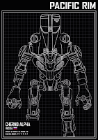
Having the illustrations finished off it was time to start working on the blueprint styled posters. On actual blue prints there are small sections of information on what the the document was on so for these posters it was decided that having information of each of the mechs would flush out the characters more.having the names of the characters higher up on the layout hierarchy means it is the second item that peoples eyes are drawn to after he illustrations themselves followed by the mechs stats. In terms of the colour scheme, I wanted to make the illustrations pop and be eye catching so having the designs in white onto of a black background makes them stand out. Aswell as this, i tried using the colours of their represented characters from the film to help people recognise the characters more when they see the film. While they work, they don't have the same presence of the black posters. For me I prefer the black background but im going to take them to a crit group and see what peoples thoughts are.


No comments:
Post a Comment